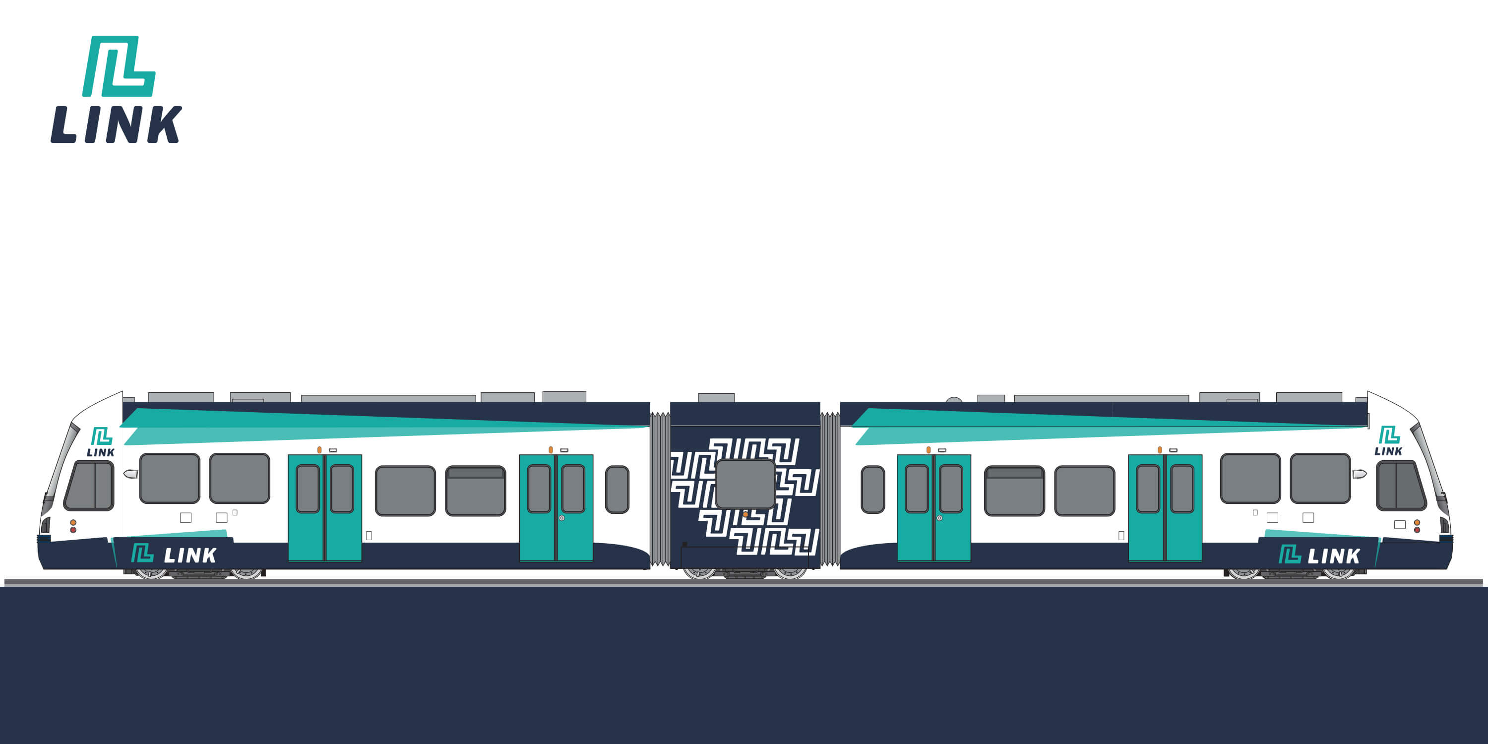
Link Light Rail
Timeline
10 weeks
Role
Branding
Environmental Design
Web Design
Tools
InDesign
Illustrator
Photoshop
Dreamweaver
The Challenge
Link is a rapid light rail transit system in the greater Seattle area. Over the past seven years, Link has serviced a direct route from Seattle-Tacoma International Airport to downtown Seattle. With an anticipated Spring 2016 expansion of two key new stations in the University District and Capitol Hill, I was challenged with the opportunity to create a rebrand of Link that would be marketed to an extended audience.
Brand Character
Smart, Connected, Secure
Brand Positioning
Link is the region's only public transit service that provides a smart transportation solution that is reliable, affordable, and effortlessly independent of traffic.
Brand Promise
We believe that changing the way we move is the only way forward. Link is a smart, first-rate network of trains that meets the need of our growing region. We're providing avenues that are free of traffic. We are committed to affordable rates and well-maintained trains with frequent service. That's why you can count on never waiting more than 15 minutes for a train.
The Approach
In the first phase of research, starting with a creative brief the brand purpose, promise, positioning and characteristics were strategized to guide the branding process. In parallel with the branding process, I also had the opportunity to sit down and meet with Elizabeth Trunkey, the design team manager of SoundTransit to take cues from Link's current brand position.
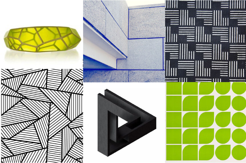
The Concept
Faced with different competitors such as buses, personal vehicles, and Uber, it is important to emphasize what sets Link apart from the rest. Link is affordable, fast, traffic-free, and reliable transportation that is easy for commuters to use. It also provides a way to connect you to other people, places, and opportunity. For the design, I wanted to highlight the directions Link can take you while focusing on the theme of connecting.
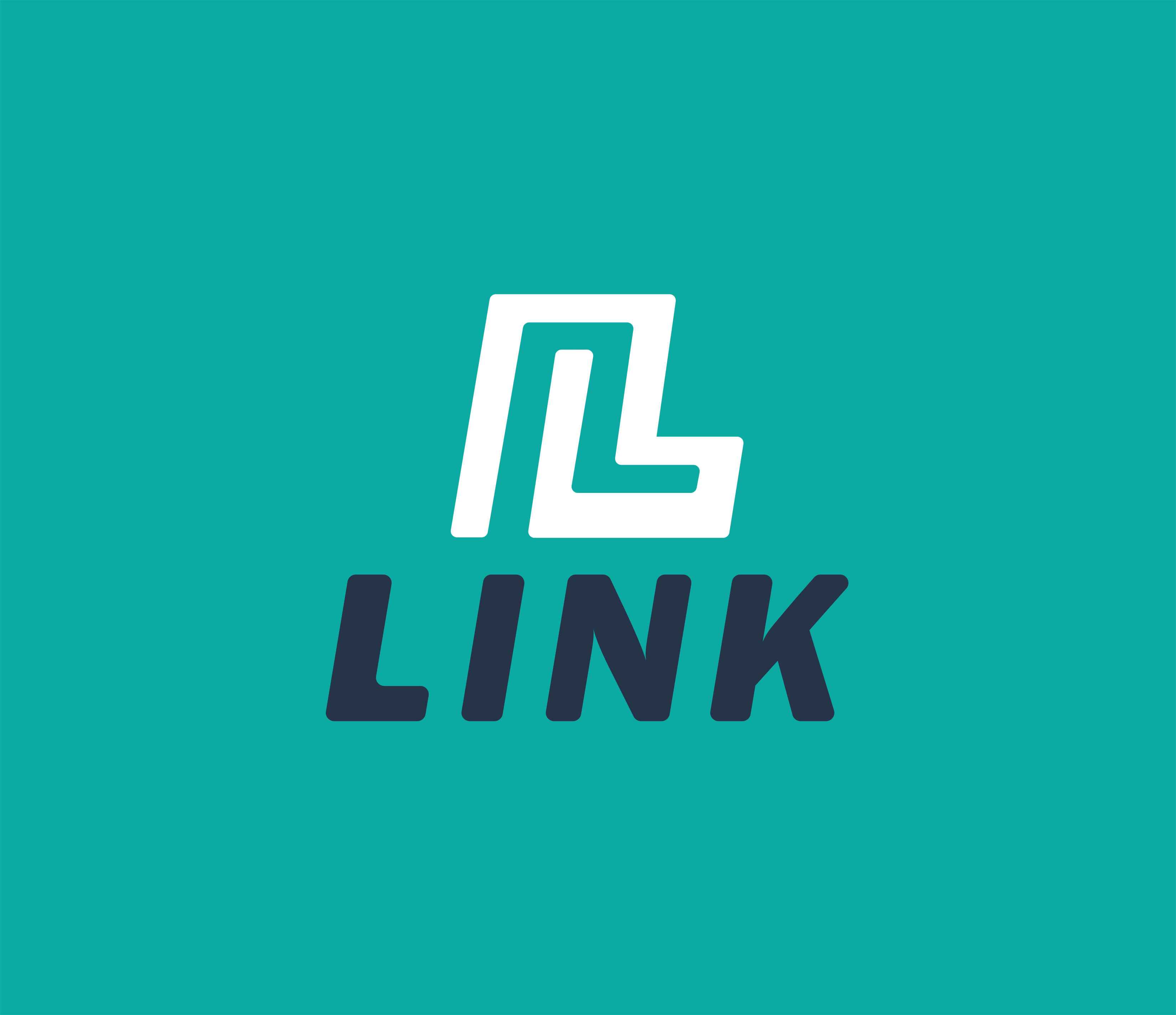
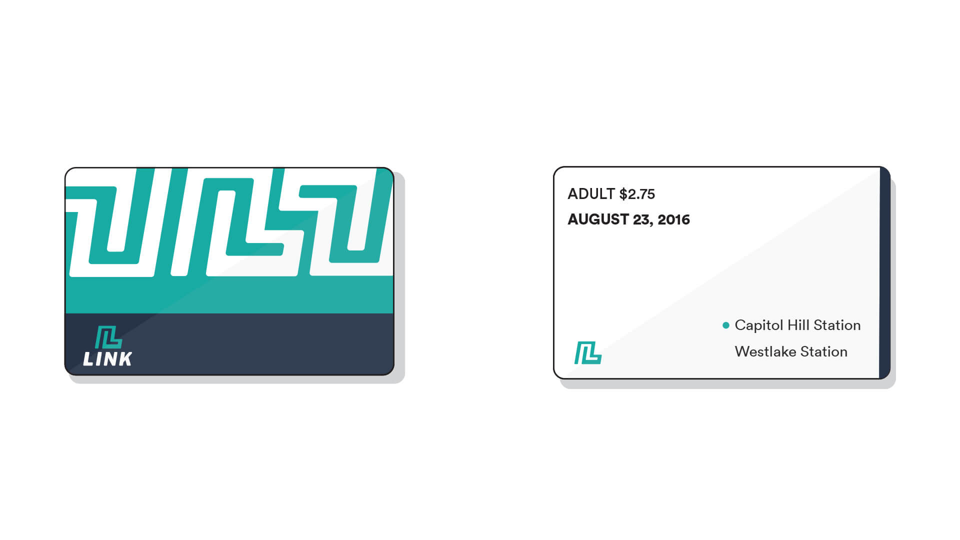
Logo Design
To create emphasis on the theme of connectivity, for the logo symbol I played with the L letterform to showcase movement and connection. For the wordmark, I chose the bold italicized typeface to show strength and movement, and altered it by rounding out the corners ever so slightly to still feel approachable and friendly.
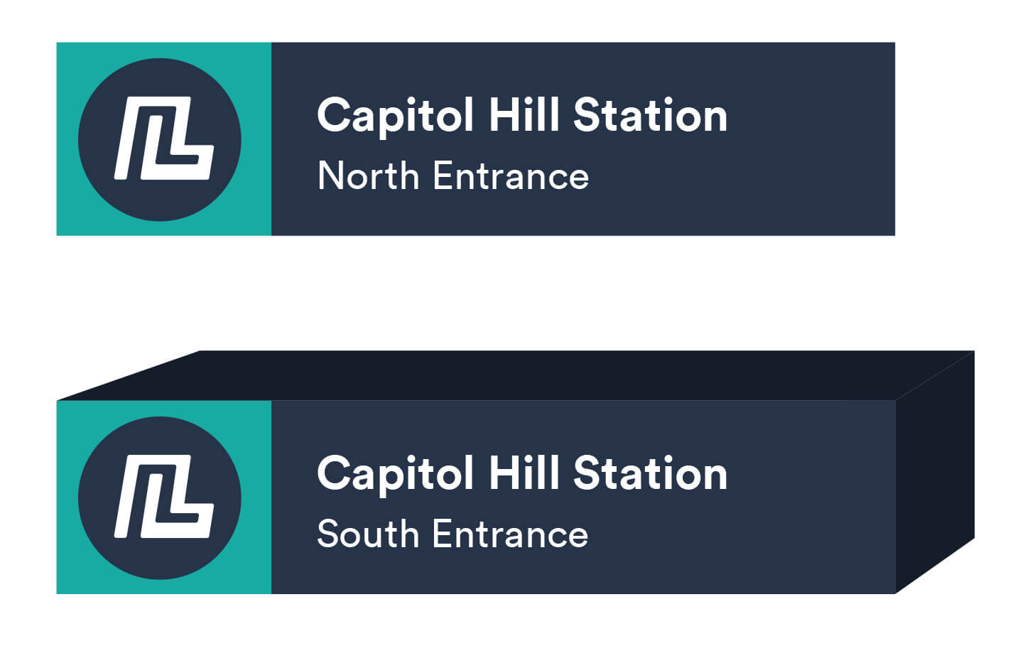
Application

Environmental Graphics
Microsite
I created a web campaign for Link in partnership with Treehouse Seattle where riders can share photos and stories of how they use Link by using #LINKUP on various social media outlets such as Instagram, Facebook, and Twitter. Hypothetically, real time results would populate below. View the microsite here.

The Takeaway
This branding project occured right before the opening of the new light rail stations in Capitol Hill and the University District. It was an exciting challenge to be doing a rebrand for Link when there was little to work off of, but provided a great opportunity for a rebrand. Early on in the research phase of the project, there was a confusion of identity with the different bus lines and the light rail system in Seattle. It all had Sound Transit all over it but had a different identity.
While researching this project and after sitting down with Elizabeth Trunkey of Sound Transit, I learned Sound Transit isn't responsible for all the different hubs of transportation in Seattle. Buses may be powered or funded by Sound Transit but is operated by King County, which explained the seemingly inconsistent brand positioning. Taking this in mind, I continued to focus on the rebrand of Link alone and how that may apply with the ongoing expansion of the light rail.
Although Link has a lot to offer, it isn't used or depended on as widely as other metropolitain cities depend on their mass rail transit. With the right branding and marketing informing users, the potential ridership can expand tremendously and be a boost for the state of Washington as the expansion of the rail system continues to grow.