Archives for October 2015

October 29, 2015 - No Comments!

Storyboarding

For our video we wanted to adpat the idea of the split screen our users wanted by showing two characters as our users in their office cubicle environment. The divider in the cubicle would act as a the split screen to show the different personas.  Our brand is also extremely friendly, so we wanted a conversational tone to the copy. We decided on having audio narration that felt informative to the user showing a solution to a relatable problem, and less of a sales pitch.

We got together to do the storyboarding. Caitlin and Michael worked in After Effects before so I'm excited to get a chance to work with an unfamiliar program. Knowing what we do know about AE we knew we had to think the transitions between scenes and how we could maximize the use doing this all on a large single art board. We discussed the visuals, tone, timing, and story line.

storyboard

October 29, 2015 - No Comments!

Character Development

After looking through a lot of our motion graphic inspirations, we decided our characters would be made up of basic shapes rather than making them actual people. I started doing some pencil / paper sketches and will later experiment with digital ones in Illustrator. We also discussed over the weekend more of a breakdown of possible story lines and the personality of our characters in it.

Pencil Character Sketches:

Screen Shot 2015-11-11 at 11.23.03 AM Screen Shot 2015-11-11 at 11.23.12 AM

Building our story:

IMG_0873

IMG_3270


October 19, 2015 - No Comments!

Logo Refinement Part 2

logo2

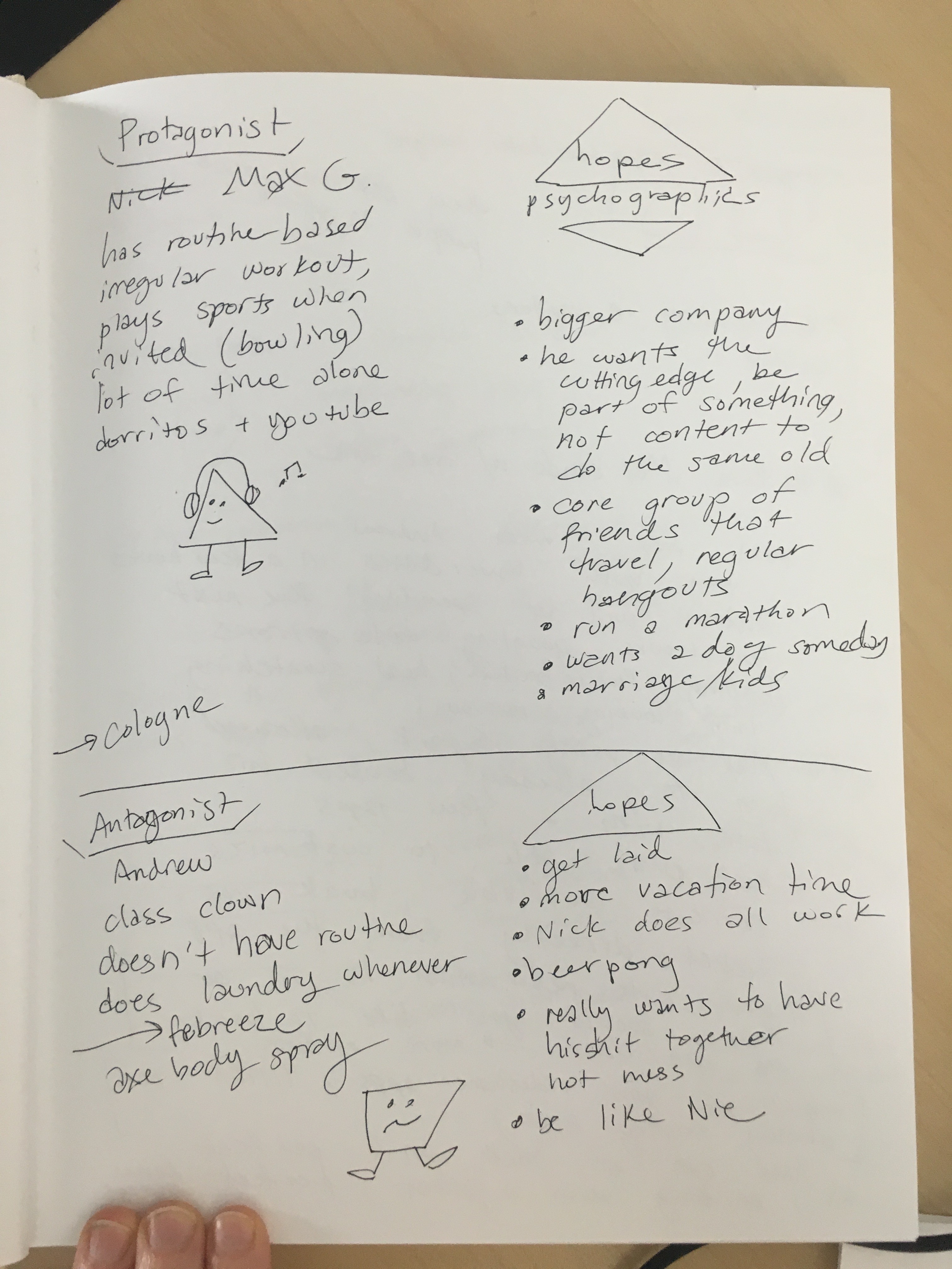
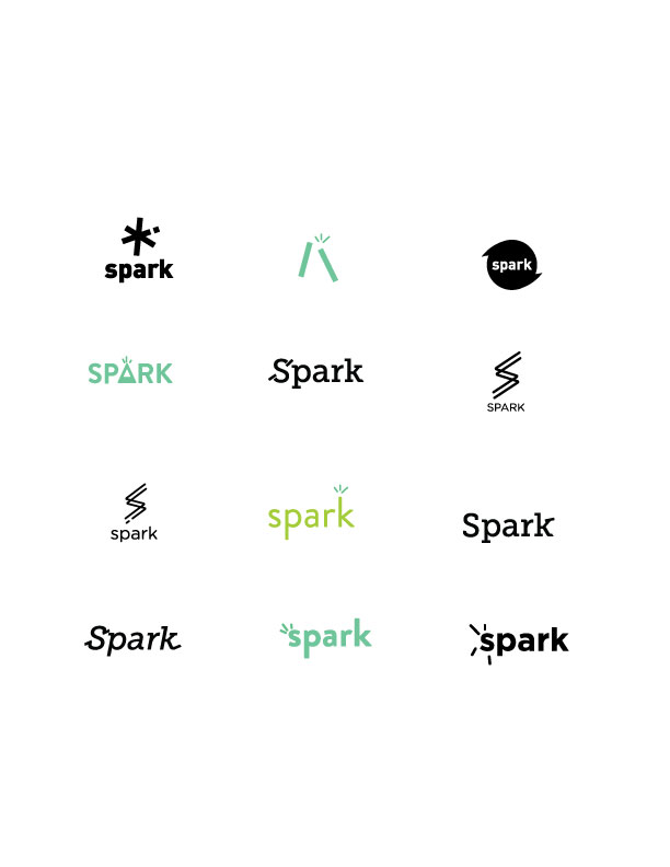
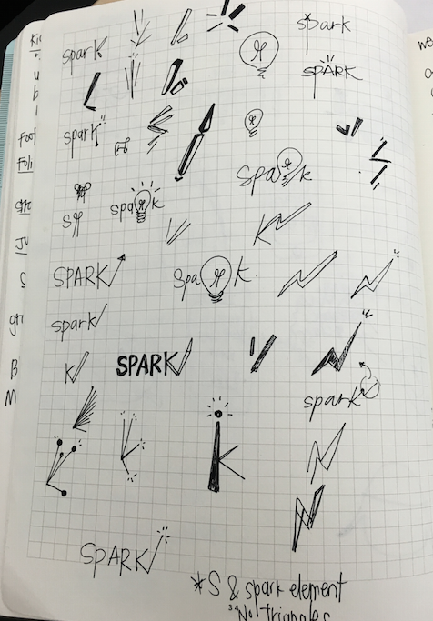
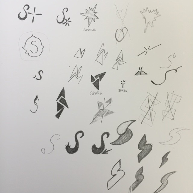
After our surveying  potential users on our digital logo variations, Michael refined the logo based on user feedback. We also started to work on the storyboarding for our video concept. In addition to this we did a user testing survey on men in our target market.

We asked people to pick their top 3 (out of 6 options) most important core concepts of Spark:

1. Getting the perfect, customized date

2. Having choices laid out for me

3. Saving time

4. Always having a dependable resource and always having a good idea

5. the promise of fun

6. catalyst for love

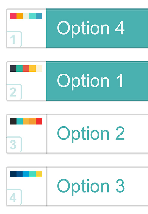
Then we asked for feedback on the color palette which resulted in a nearly unanimous response for option 4.

color

Lastly we wanted feedback on storylines for our video. We asked people to with in on the following:
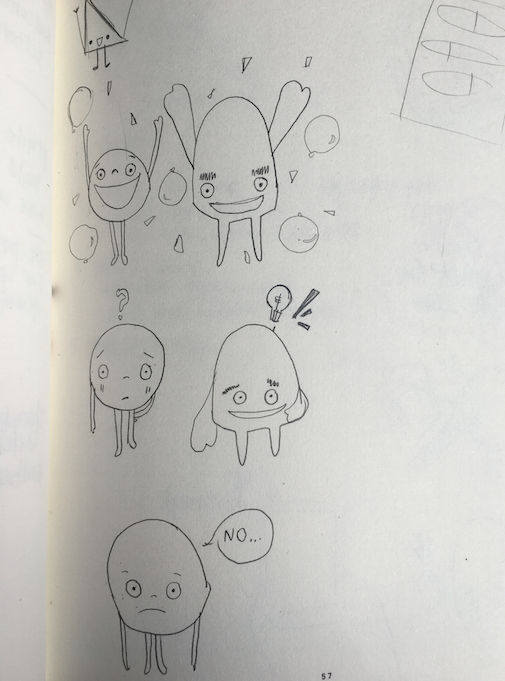
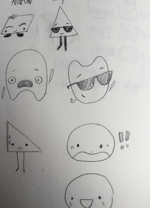
1) “Game time”

Basic story:  You watch a guy move through his day, a few ups and downs, catalogued on screen as “wins” and “losses”, using animation. Guy uses Spark app to plan out date quickly and successfully while busy.

Sample language:  “Eats healthy breakfast” (shows donut and coffee, shows that he loses points), “Finds perfect casual but romantic bistro” (shows him using app, winning points) “Makes reservation for 7pm” (shows him using app, winning points)

2)“Better Getter”

Basic Story:  Split screen of someone using the app contrasting to someone planning a date without the app. See the app user winning, watch non-app user struggling until pushed off screen.

Sample language:  “Using Spark is easier than filling a laundry basket with kittens. Dating isn’t easy, why not use Spark?”

3)“Bad wingman”

Basic Story:  Guy messages his buds to tell then he got a date with someone awesome (show messaging popping up around him as he moves through his day. In the time they can suggest terrible date ideas, he uses Spark to find a perfect date.

Sample language:  “”You should totally take her to game works!” “I got a reservation already. Thanks for being terrible at suggesting date ideas, but being great friends!“”

The split screen resulted in the most popular story line. Our next steps will be to solidify the storyboard for our video.


October 13, 2015 - No Comments!

Logo Refinement

This week we took the feedback we got on our sketches from Robynne Raye and digitally translated them in Illustrator. Our logo would be used for an app, we wanted the visual language to translate well on the web. We experimented with mostly san serif fonts to communicate a friendly approach in our brand. We also did some subtle adaptations to the letterforms (a little spark..ha). There was an attempt in altering a slab serif but it felt too harsh. Here are the digital iterations:

logoiterations1


October 10, 2015 - No Comments!

Spark : Logo Development 1

This week we honed in on trying to get the name down for our date planning app. Below is a list of names we generated.

nameideas

We surveyed individuals within our user profile for feedback separately to see what name they felt best represented the brand concept. Ultimately the winning name that pulled the most votes was "Spark." From there we started sketching logos that equally expressed the name and brand. Logo design has been proven to be a struggle in trying to communicate the brand without necessarily making it carry the entire literal message of it. Here are a few of our sketches on logo iterations. We wanted to show the feeling of excitement and competence in our logo.

Screen Shot 2015-11-03 at 12.52.08 PM

sparksketches


October 7, 2015 - No Comments!

SCCA Design Sprint

Today in Special Topics we did a 1 hour design sprint. In 1 hour we had to design an open house poster for print and web geared towards potential SCCA students like ourselves. It was challenging and fun with the time restraint trying to calmly design while my brain is scrambling simultaneously. Overall I'm happy with the results considering it was an hour but definitely see things I would tweak and change. I ran out of time towards the end while doing the web version and would want to make it slightly different than the print version. I wanted to create a fun and playful poster while keeping a minimal design.

Print:

silva_openhouse

Web:

silva_openhouseweb

silva_openhouseweb2

(I just couldn't totally decide on the placement of the date info on the web version so you get both)


October 3, 2015 - No Comments!

Special Topics : Dating App Concept

This quarter for Special Topics I'm partnering up with my fellow talented peers, Caitlin Esworthy and Michael Woody. One of our design goals is to explore branding and brand strategy and make a large quarter long-project out of it. After several brainstorming sessions and tough debate on a few great concepts, we narrowed it down to one we felt would be the best fit for us at. Our concept is a mobile dating application that will help the users find tailored first date ideas. With the increase in online dating and a dependency on tech devices there is a lack of time for creativity in making that good first date impression. Today we met up for a little white boarding brainstorm session and honed in on defining our app and primary user.

whiteboard_1

Whiteboard Brainstorm Session: Defining the qualities of our brand, the user, and positioning.

The app’s primary function will be to assist people with finding resources to plan a creative and successful date by providing a comprehensive database that customizes the experience based on the user’s input.

Our primary users are broken down into two categories. The first type of user would be someone who has a date lined up but doesn’t quite know what to do next and needs to use our app to create the perfect date to move to the next level. The second type of user is someone who is already in a long term relationship but needs to reignite the spark in the relationship by finding a new creative date in our app.

We also put a lot of thought into defining what our brand IS and ISN'T and what our overall position is. In conclusion we felt our brand is 70% excitement and 30% competence. We thought about celebrity personas that reflect our brand as well and Max Greenfield from New Girl and Ellie Kemper from Unbreakable Kimmy Schmidt came to mind if we could put some faces to it.

On Sunday we're going to meet again to create a timeline for our project and get more research done for the deliverables we want to include. Overall really excited about having full creative control on this project and can't wait to see what we create over these next 10 weeks.